Anders Petersen and Jacob Aue Sobol - Veins

I have a slight obsession with Jacob Aue Sobol that was already well developed prior to buying this book. It would be an interesting survey to complete of the people who have purchased this book, how many bought the book for Petersen and how many for Sobol? I was squarely on the Sobol side of the fence when I made the purchase, but may be sitting more on the fence after taking in the images. This is a fantastic thing. That youre able to take in the pages and not have a clear favourite artist in a collaborative book is on a simple level good value for money. On a more complex level, its a great achievement by the two artists involved in producing a book that flows so well even though its not the product of a single photographic eye. Sobol is just an amazing talent and also a very interesting and passionate man. I am sure thats a statement that applies to many of the past and current Magnum crop. After seeing a long video of him speaking at the Nordic Light Festival about his latest project, this was further cemented. Its a long video, but its well worth sitting down to with a nice glass of red and taking in what Sobol has to say.
As I said above, when I bought the book I was looking for something by Sobol, something that didnt require a small private loan to purchase. I still lust after a copy of Sabine, but I will struggle to part with more then $500 on a photo book, and they wont be getting any cheaper unless theres a reprint at some point in time. Of course the fact that Petersen was also involved in the book is a great thing. Their styles are so complimentary of one another.
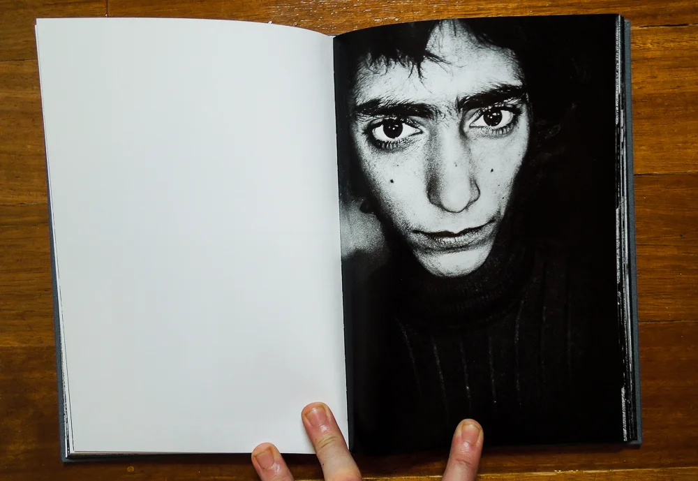
The book opens with work from Petersen, and right from the get go I was very happy with the fact that I chose the book. The raw a gritty black and white. High contrast images where the contrast is used so well that its restrained in its over the top impact on the images. It takes such a skill and a well educated eye to be able to push the limits of the printing process for this kind of image.

This is one of the opening pages of the book. The second page of images presented from Petersen. What a pairing. I dont know if this lady would be overly impressed about the suggestive nature of the paired images here, but I love it. A little cliche maybe? Perhaps, but you know what, its far from cliche when you are one of the people who influenced the development of this kind of style in photography.
These are the sort of images that when paired together like this really inspire me. These are the sorts of pairings that I would like to be able to achieve in my own work some day. I dont know if these are things people go out to find, or if they are things generated by artists that have an extensive library of work from which to sequence a book from. Either way I like it a lot. That whimsical and sometimes dark humor that cant be escaped when presented with the two images together.

Petersen continues to make these pairings in the book, that although are funny on one level, are also dark and a little foreboding on another. That snapshot feel to some of the images in the book is almost comparable to Moriyama in some ways, but a little darker. This is likely a bit of an insight into the minds and personalities of two of the masters of this kind of image.
The lighting and the contrast throughout the images from Petersen are very consistent. Its something that continues through the book and into the Sobol section. There is a clear transition to the second artists eye though, with the print and tones in the images shifting just a little. Its a very interesting thing to see. Something that you dont get to see in many books at all.
Another collaboration book that I have called Mono is another example. Mono has such a large number of artists that its not possible with the small numbers of images that each has in the book for the reader to get settled with the style of the artist before there is a shift. With Veins youre presented with enough images from Pertersen to become immersed in the sequence, the flow and the consistent style of the first half of the book. When the shift comes to Sobol's section it refreshes the eye. Although they are very similar, the differences are enough that there is a feeling of change. A change of pace maybe. A change of emotion more likely.

Petersen's work in the book shifts in a sort of haphazard manner as you take in his half of the images. Some of the images have this bipolar type feel to them. They are of scenes that are clearly filled with passion and even love between the subjects on one page, and often presented together with an image that leaves the reader a little split. The set above is a good example of this. The first image showing a lovers kiss. Even though this is clearly an intimate moment, the image itself is still a little unsettled. It seems to have been shot through a screen, or a dirty window. This separates the viewer from the intimacy of the scene for one thing, but tarnishes what would have been a scene of two people sharing a pure moment with a feeling if dirt or grime quite contrasted to the moment being shared by the subjects.
The image is then paired with this weird surreal shot of two small figures that look like they are contained in a jar of some sort. I dont know if they are real, or if this is a model of a pair of what look like conjoined twins in some sort of preservation fluid. Either way, the image sets the mind wondering. Maybe this is the bi product of the once pure, but now tainted union on the preceding page.

I mentioned above about the snapshot style that Anders Petersen. We really get the impression with some of the images by Petersen that we are following his eye to items of a highly random nature. These images are dispersed well amongst the first half of the book. The consistency with the images laying in the process. The consistent tones and contrast levels throughout the images. The familiar grain and edgy gritty look flows through the images.
We have a really interesting range of subjects from Petersen as well. From people who have that troubled feeling that comes with the high contrast nature of the images and subsequent image sequence that has a strong suggestive nature to it, to the ordinary made interesting like the images above. The locations of the images also transition through the opening pages of the book. Some places inside, and others in what look like wild woods or in the case of the image below, the cold and baron snow. Even with this diverse nature of the subjects and locations, the images seems to have a cohesion to them that almost comforting when delving into the dark nature of some of the photographs.

As I said earlier in the piece, Petersen's intro to the book was not so much surprising for me, but a bonus. Sobol is probably my favourite of all the guys at Mugnum, and I really wanted to own one of his books. I have recently ordered a copy of 'I, Tokyo' as well, but ordered a French copy as it was a LOT cheaper than the English editions that were available. Sabine on the other hand is a whole other kettle of fish. The cheapest version that I have seen is about $500US. An insane price to pay for a book for me right now. I cant say that I wont yield at some point in time and buy it, but now is not that time.
Enter Veins. And enter Sobol's half of the book. There is a short section of text by Gerry Badger that separates the Petersen section from the Sobol section of the book. In this section Badger refers to the stream of consciousness style that was pioneered by artists like Klein and Stromholm. I think this is a great way to describe what I was stating earlier about Petersen taking the viewer to where his eye goes. That is paramount to this stream on consciousness style and is something that others of the Moriyama guild also excelled at during the Provoke era.

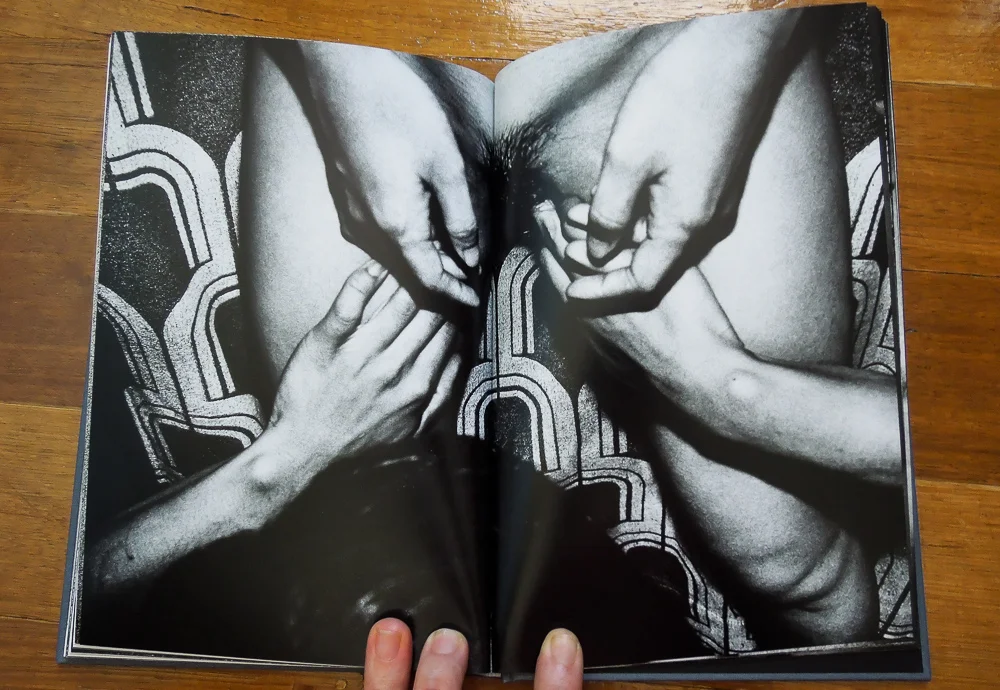
As an intro we're presented with this slightly surreal image of hands on a stomach. Its a great lead into his images. Has that really well restrained grit and grain, and the highlights that are just a touch on the grey side. Its really hard to do the images justice on the screen with a little point and shoot camera taking the photo, but I try.
For my eye, one of the things that defines a Sobol print are the highlights. The whites in many of his images are not quite white, not that they should be of course. I dont know how to explain it. There is a moster amount of contrast in his work, as there is with Petersen's, but Sobol's images just dont seem to have the level of white in the highlights that a lot of other photographers do. Its like the contrast is high on the black end of the scale,
I think one thing that Sobol tends to do consistently is add texture to his images. They are never flat and either through the use of grain in the film, or through the use of a textured background, there always seems to be this added tactile nature to his work.
He also has this ability to display a connection to his subjects through his photographs. If you take the time to watch the talk that he gives in the video at the start of the post you will gain a little insight into this fact. He has respect for the subject. He spends time with them. He immerses himself in their culture and their habitat. He goes to huge lengths to achieve this. Some would argue that some of his work is a little derogatory towards his subjects, but this is not something that I take away from his work.
For me, Solbol has the utmost of respect for his subjects. The photos produced that portray the subjects in a dark light, or a less than flattering situation still have this sense of telling. A sense that he really is getting to the crux of the emotion of his subject. This fact alone is the utmost display of respect for ones subject. The ability not to hide the truth. Not to make ones images lie. The ability to tell the story of the subject, and the whole story. That ability resting in single images is such a talent.
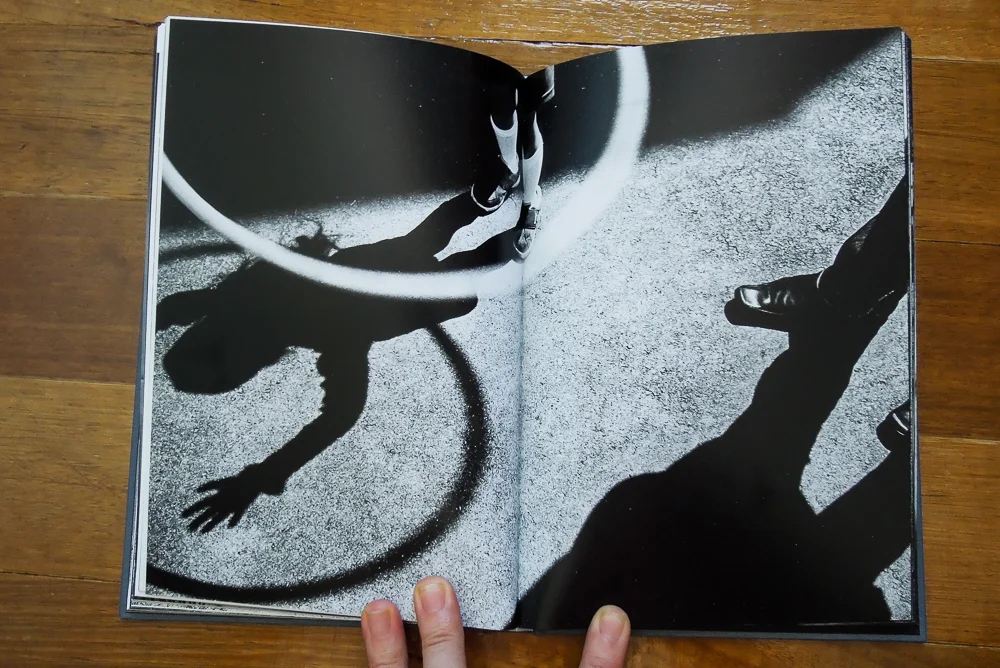
Jacob also shows some similarity in the snapshot or stream of consciousness type style that we discussed in Petersen's section. I dont think that the photographs by Sobol, either in Veins or other books he has produced, have the same random feel as Petersen or Moriyama though. There seems to be a bit more cohesion to the images.
Rather than being random glances of information that was deemed interesting enough by Sobol to make a photo of, these images seem to have a relationship to the subjects in the book. There is a link there that is greater than the tonal range and contrast. Its greater than the grit and the grain. There seems to be a connection between what would otherwise just be a girl with a hoop and a mans shoe. There seems to be some form of emotional tie, an emotional bond of some sort. A shared sense of being. A belonging in the pages.
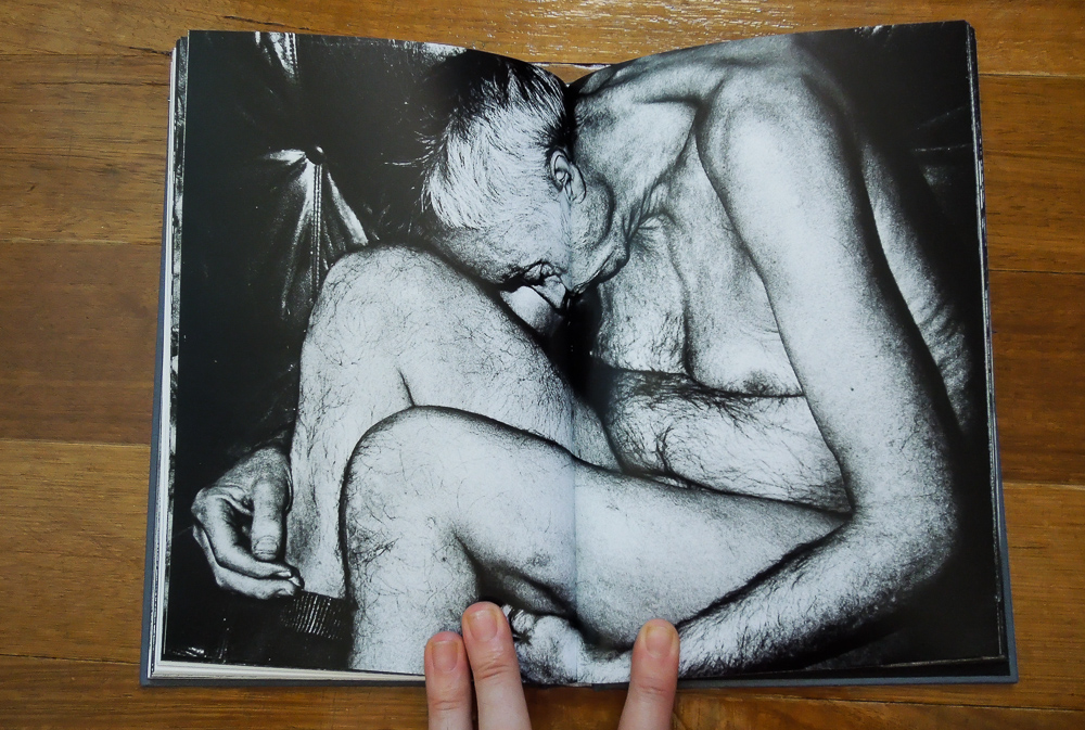
We've already discussed the fact that Jacob is able to paint these pictures of his subjects in the sometimes harsh light, both literally and figuratively. The image above is a clear example of this fact. Its a confronting image of an old man curled up in the foetal position. Even though its confronting, its raw and real. One cant argue that it doesnt display whatever hard reality this subject was facing at the time the image was made. It leaves the viewer with the option to either continue to be confronted with images like this, or find another persons work that is better suited to their eye.
The contrast and starkness of the processing in Jacob's work suits the subject matter to a tee. The stark emotional reality of the subjects highlighted by the stark nakedness of the black and white. I think that this is the way with a lot of the work that is portrayed in this high contrast look. Its hard to process an image in this manner and not have at least some dark sinister connotations conjure in the mind of the viewer.

Even when there are no human subjects in the images there is still this feeling of emotion that is generated by the tones and the suggestive nature of the photos. Simply a door. Closed. Shut. This transition of dark to white and then back again. The almost dirty feel thats created by the grain. That texture. The texture that gives the image a almost 3D feel to it. Something you feel you could rub your fingers over and feel on the image itself.
Even when he shoots a door, its the most emotional door you will ever see. I think this is what sucks me into his work. Its the connection you get with the images. Left to my own devices I could spend hours and hours with this book and be quite content. The buy product of this is the length of this post. I started to write about these images and couldnt stop.
I will leave you with one last image from Sobol's section of the book. Its a set of images that sum up the diverse nature of the images on a couple of pages. One page a simple stark still life image of some straws in a glass. On the adjoining page, an emotional and deeply personal moment that Sobol is masterful at catching between his subjects. I will leave the interpretation of the fact that these images were selected as a sequence to you.

Its a wonderful book. Its a book that I am sure will be hard to find at some point in time as are the other books by Sobol. I cant recommend it highly enough if this is the type of work that piques your enthusiasm for the still image.
If you have some energy left then I have attached some links to some great interviews with both Jacob Aue Sobols and Anders Petersen. They are both intriguing insights into some very gifted proponents of photographic skill and I would recommend taking them in sometime.
Interviews with the artists
Thanks for taking the time to read my ramblings. I do write these as a means of getting value for my money. A means of taking in the images in the book and really trying to delve into the artists intentions. I hope that others are able to get something out of it as well, no matter how small.