Michael Ackerman - Half Life
I was lucky enough to get my copy of Half Life by Michael Ackerman a few months back. A good friend let me know about the book and the fact there were a small number of them available from VU. He said that I had to buy it, simple as that... It was sound advice and shows how much this friend knows my style of photography. I have contemplated the book for these few months and each time I pick it up I find some new reason to love it more and more. Simply a stunning collection of dark deep random images that come together to form a special special book... I am sitting here at the moment listening to a French House playlist... Funky. Different. French.
There is a little of this in Ackermans book. The copy I have from VU is in French. I will have to get someone to translate it for me as I really want to know what the words say. The fact I dont know at the moment has forced the pictures to take center stage. Its the way it should be.
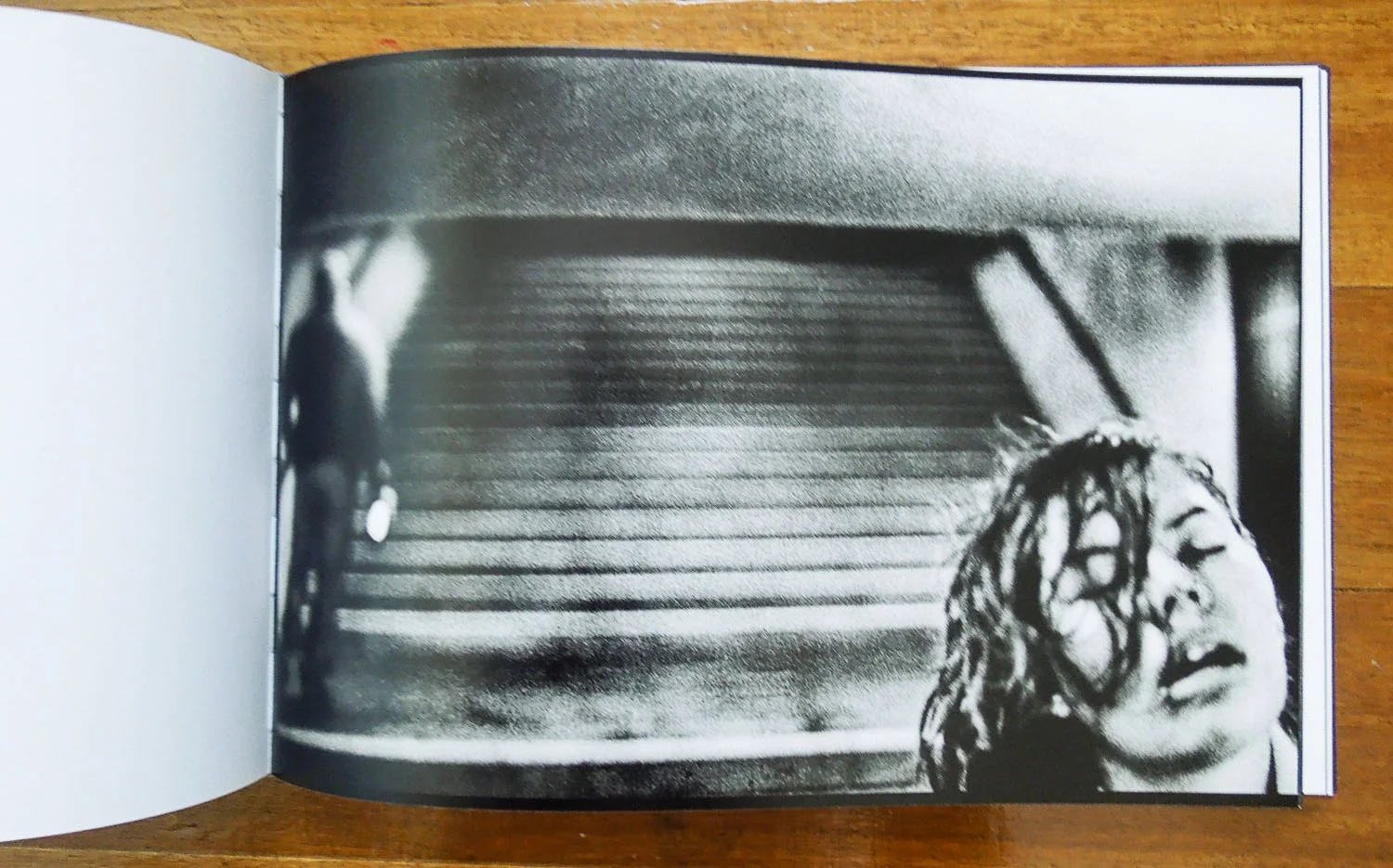
I have been racking my brain since getting the book to try and think of another publication with such a diverse range of formats and presentations. I cant think of one. I thought Moriyama was the master of randomness, and he may still keep this title. Ackerman on the other hand might be the master of making something look random at the first viewing, but when you delve deeper into the sequence there is something there. You start to see the order to it. There are even a few pages where there are fold outs with these huge panoramic images, too wide to photograph for this post.
Some of this feeling is also reinforced by the almost organic framing of some of the images in the book as well. Some of the images when printed dont have a hard edge to them. I dont quite know how to explan it, but in some of the images its as if Ackerman has decided to show some of the negative outside the frame of the photo. Its something that can easily be applied in a filter in post or even in Instagram. But this i the actual technique in use. It splits the images and forces the reader to make a further assessments of the reason behind a decision to print like this. An intelligent way to add some points of interest through the book.
There is something personal about the images. Something makes it quite obvious the photos are very close to Ackerman. There is a darkness, an almost sinister feel generated through the viewing. A brooding and deep sensation that some may feel is a little unsettling. Not me. Although the darkness is there, its not in anyway evil or bad, its calm and almost inviting. This might say a lot about Ackerman, and maybe even just a little about me. the depth to the images is encompassing and when I am drawn to pick up the book I need to finish it. It was never a book I was able to simply thumb through without reaction.
I dont want to make the comparison to Moriyama too much in this post, but its there for me. The work has a similar aesthetic to Daido, but thats where it stops for me. Unlike Daido, there seems to be an intent to the images. A reason. Maybe the comparison is more with Sobol. Maybe there shouldnt be a comparison at all.
The first 2 images I have shown above are the introduction to the book. A clear set of portraits of troubled faces. The square format is always so final in its statement I find. The equality of the square leaving no place for the subject to hide in the corner. No room for error from the artist. In the case of Ackermans work in the introduction of Half Life, no room for judgement. These people set the scene for the book. They bring an unease to the very first pages presented. Their presence is purposeful and dramatic. They have a story to tell, but there is no indication if Half Life is their story. It might be, but it might be as much yours. Throughout the rest of the book there is never another clear head shot like these. There is some vague human forms in some of the photos. There are photos of people from a wider view. But these are the souls selected to represent the artist in Half Life.
As I stated already I get the impression from Half Life that the story is Ackermans. I have his other books as well. I will endeavor to post on them at some point, but as some will know these posts have been sparse for a while, I have been busy. The feeling I was left with after spending time with Half Life drove me to find copies of his other work. I felt connected to the work in such an intense way.
I dont expect that will be the same for all, art and photography are such a personal thing. Its why us introverts are drawn to get lost in their pull. After getting his other books, if youre going to buy only one, then Half Life is the one to get. It feels more mature and complete. In saying that, seeing the maturity develop in his work is a special thing through the three books I have, so if you like the work and can afford it, its an unique perspective.
Just like the fact that some people wouldnt take to the house music that is playing at the moment, some will find the images made by artists like Ackerma, Moriyama, and even Sobol and Petersen (though I think to a lesser extent) a little abstract. In the current environment of technology and digital this is understanding. People are not shown this type of image unless they seek them out. They dont get accustomed to them. They are not trained to see in this way. They are trained in clarity. They are trained in clear, crisp digital images. The obscure abstract nature of this type of work leaves room for the imagination to run wild. This is also confronting for some people, especially when the subject matter is a little dark.
People are not used to having to think about photographs. The net is such a wonderful place to find photography in my eyes. But you have to spend time scratching at the surface a little to find what youre looking for. As you start to develop taste and a keen eye for what you like you will start to find it, but its these images on the surface that are what most see. The photographic image and its purpose in the world is changing.
Ackerman, and others like him fly in the face of this change. We see article after article promoting the clarity of lenses. The Image Quality of new sensors... Reviews of new cameras by real users who think they know what we need to know about the new model. They think we need to know how fast the auto focus is. They think its important to tell us that the new model has a touch screen on the back. These are all well and good, and Im not one to tell you this isnt something that you might need in the sort of photography that you want to create. Just as Im not one to tell you that Ackermans book is something you will like. I can just provide you with my thoughts on what my eye sees in his work.
The thing about Ackerman is the equipment he chooses to use to make his work also flies in the face of the technological age. He works with a Holga for a lot of his work. A plastic lens camera. As with some of the others I have mentioned in this post who use dated compact film cameras, Ackerman chooses a tool to complete a task that is perfect for the type of image he intends to make. This type of tool, and the analogue medium adds to work like this. Things that I may have mentioned in the past, but I will cover again quickly here.
- An organic and natural feel to the images. Partly from the film, and partly from the at times hazardous depth of field.
- A connection with the artist that would otherwise be difficult to achieve. The time taken to complete the end to end analogue process results in a part of the artists being poured into each work.
- A unique and individual nature to each and every print. It would be impossible to produce a second print like it again in the darkroom.
The amazing thing about the work in Half Life in the quality of the image is consistent. There are no fillers. I would more than happily stare at each image in its own right as a stand alone single. To bring such an intense set of work together in one place and be able to tell a cohesive story is an impressive feat. Usually the strength of the images would slowly die off through repetition. The absolute energy oozing from the images in Half Life helps the reader to stay entertained in some ways. In others its the simple fact that each pieces is so different. So unique. Requires such a level of analysis to understand the depth to both the image and the technique used to obtain it. The fact that I want to understand each and every one is testament to their quality.
I usually dont show a full roll of images after a post, but as I said at the start, this is a book whos few words I dont know how to read, but whose images I feel I understand. I dont think there is more that I would like to say about the book, there isnt really any point in writing for the sake of writing. I will leave you with some of the images from the book. I hope even this small number of images can help you understand the place the book holds on my selves.


